What is a cryptocurrency heatmap, and how to use it

In trading and investing, experienced users rely on a range of auxiliary tools. One of the popular and at the same time simple tools is the cryptocurrency heatmap.
Professional traders use the cryptocurrency heatmap as part of their arsenal, making the process of market analysis easier.
What is a cryptocurrency heatmap?
A cryptocurrency heatmap is a visual tool that displays market data in graphical form. A cryptocurrency heatmap is used for initial screening and rapid assessment of the state of the crypto market.
In other words, a cryptocurrency heatmap gives investors and traders an understanding of the current sentiment in the digital asset market by transforming complex market data into simple visual patterns.
The key data displayed on a cryptocurrency heatmap are:
- Short ticker and asset name;
- Current price of the digital asset. This parameter is customizable: the user can display cryptocurrency prices in US dollars or other national currencies.
- Percentage price change over a day or another period. The cryptocurrency heatmap shows both positive and negative changes.
- Market capitalization of crypto assets. Most often, the cryptocurrency heatmap shows the top 100 digital assets by market capitalization.
- Also, the cryptocurrency heatmap may display the current trading volume for each digital asset.
Unlike the traditional numerical representation of market capitalization and other data, the cryptocurrency heatmap reflects data in graphical form on a single dashboard.
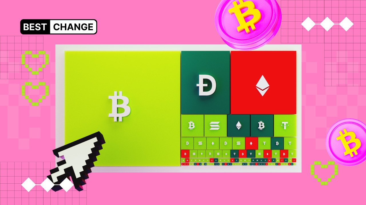
Each asset on the cryptocurrency heatmap is represented as a square, the size of which depends on market capitalization. The larger this indicator, the larger the square on the map. Thus, the user can quickly assess and compare the market capitalizations of different assets.
In addition, each square on the cryptocurrency heatmap has its own color: green or red. The green color of a square indicates a positive price change over the period selected by the user (by default, one day), while red indicates a negative change.
Depending on asset volatility, the colors of the squares on the cryptocurrency heatmap have different shades. The brighter the green color, the greater the asset's growth. Conversely, the darker the red, the stronger the percentage decline. This allows you to quickly assess the current dynamics of the crypto market over a day, a week, or another period.
How to use a cryptocurrency heatmap?
The most popular cryptocurrency heatmap among digital asset users is the Coin360 service.
On the main page, the same cryptocurrency heatmap is displayed, which was described in detail in the previous section.
The overall area of the cryptocurrency heatmap is divided into zones, each corresponding to its own category. For example, Bitcoin occupies a separate zone that accounts for more than half of the entire cryptocurrency heatmap.
Besides Coin360, cryptocurrency heatmaps are also provided by well-known monitoring services such as:
- CoinMarketCap (Crypto Heatmap section)
- CoinGecko;
- TradingView (Crypto Coins);
- Blockchain.com (Prices Heatmap);
What alternatives to the cryptocurrency heatmap exist?
The cryptocurrency heatmap in the form of square zones is only one visual format of the tool. There are other ways to present a cryptocurrency heatmap.
For example, the CryptoBubbles cryptocurrency heatmap displays digital assets in the form of moving bubbles.
In addition, besides the classic cryptocurrency heatmap, there are specialized visual tools. One such tool is the liquidation heatmap, which visualizes areas where liquidation points of open trading positions (both short and long) are concentrated.
A liquidation heatmap is a kind of "market X-ray" that highlights vulnerable spots and levels that can trigger cascading asset movements.
